Role
Product Designer
Sep 2020 - May 2021
Toolbox
Figma
Notion
What I Did
Information Architecture
Wireframing
Interaction Design
Visual Design
Interactive Prototyping
Team
3 Product Designers
7 Developers
1 Product Manager
At-a-Glance
In Spring 2018, community members gathered to share their experiences around the rapidly increasing costs of living in South LA. Residents not only voiced the obstacles they faced in meeting their basic needs, but also expressed a clear vision for the future.
Affordable South LA (ASLA) gives renters a platform to share their stories and aims to inform the city in crafting policy solutions to address housing, employment, and access to basic services.
Updating ASLA's digital presence
This website redesign was undertaken as part of Code the Change, a USC student organization that provides pro-bono tech consulting to nonprofits in LA. ASLA's outdated website was hindering their ability to effectively share renter testimonials and educate the public on LA housing.
The old ASLA website had a few key issues.
Limited functionality: The testimonials page lacked interactivity, making it difficult for users to navigate and connect with individual stories effectively. Users are unable to sort and filter, and it was not possible to find other community members with similar issues.
Outdated design: The site's UI was not in line with modern web standards.
The Old Website

I interviewed my client to define target users and goals.
Target Users
General public: residents, visitors and community members
Policymakers: researchers, advocates, or organizations

Notes from my client interview
Primary Goal
How might we create an interactive platform that allows South LA residents to share their housing experiences, empowers the public to understand neighborhood-specific issues, and facilitates the exchange of helpful resources, while ensuring content authenticity?
Key Objectives
Design an effective way to showcase individual testimonials
Allow users to see the distribution of testimonials across different neighborhoods
Implement a filtering system to allow users to sort testimonials by relevant criteria
Structuring diverse personal narratives into meaningful categories for different audiences.
With a large collection of individual testimonials spanning various housing issues, we faced the challenge of organizing these voices into a coherent structure that could serve both the general public and policymakers effectively.
Our task was to create a system that could categorize testimonials into themes and broader categories while maintaining the impact of individual stories. We ended up with the structure outlined below.

insight
Personal stories needed contextualization within broader themes to be truly impactful.
Individual voices gained more significance when grouped into themes, allowing users to see patterns and shared experiences.
DESIGN SOLUTION
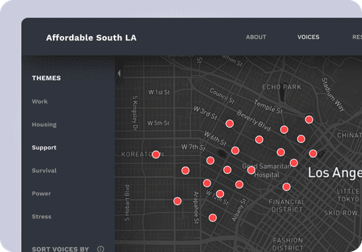
We designed a theme selection bar in the left side panel of the interface.
Visual Organization: Themes are displayed as clickable elements in a vertical list, providing a clear overview of available categories.
Interactive Exploration: Users can click on a theme to filter testimonials related to that specific topic.
Contextual Information: When a theme is selected, a pop-up appears with a brief description of the theme, offering users broader context before they dive into individual stories.

insightS
Two distinct user groups required different approaches to data presentation.
The general public sought understanding and connection, while policymakers needed actionable insights for future initiatives.
Balancing "Community Voices" with "Different Futures" was crucial.
The system needed to showcase both current issues and aspirational visions to provide a comprehensive view of the community's situation and desires.
DESIGN SOLUTION
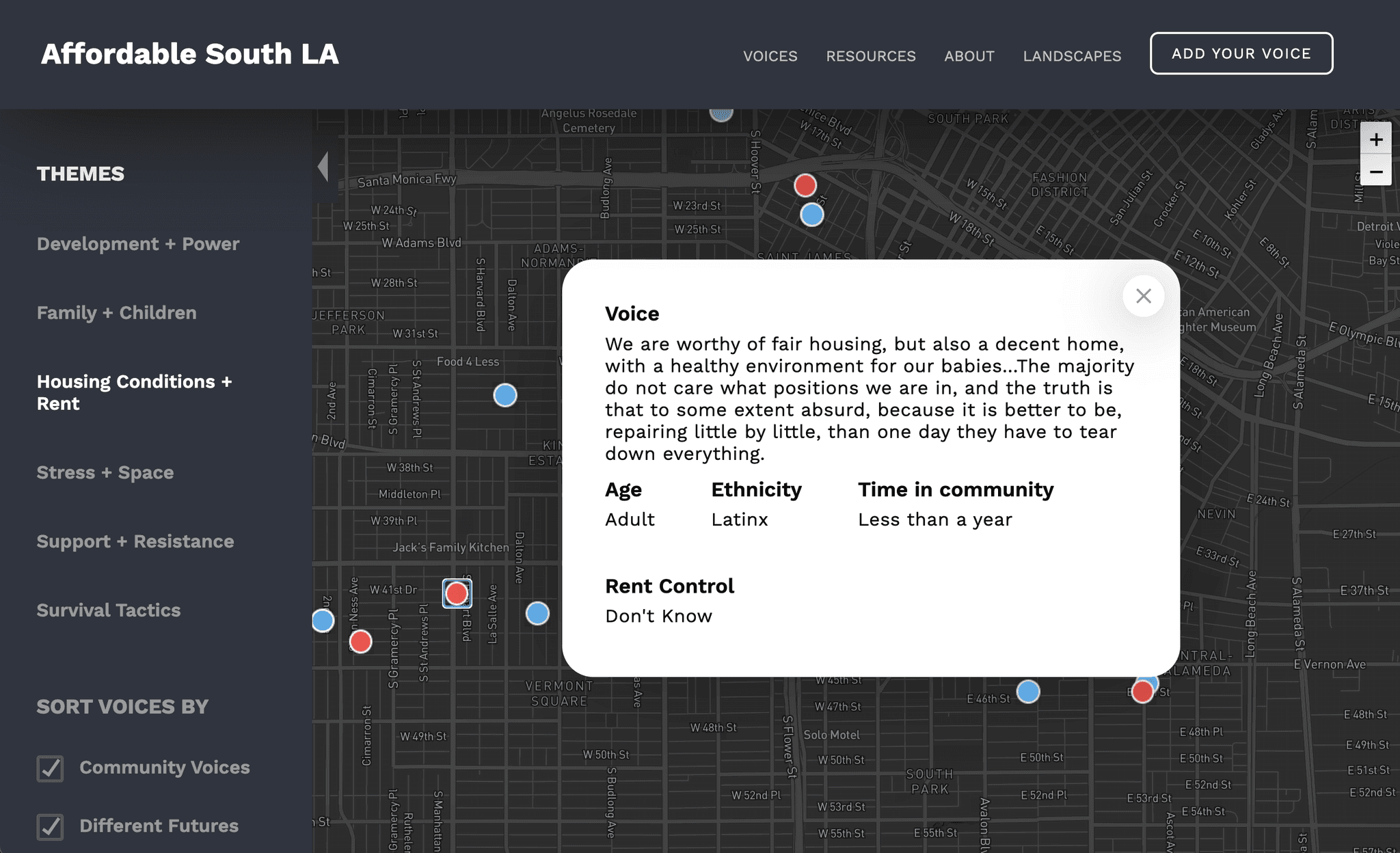
Dual-Purpose Filter System
We implemented a filter system in the left side panel:
Checkbox Selectors: Two main checkboxes labeled "Community Voices" and "Different Futures" allow users to toggle between these categories.
Color Differentiation: Points on the map are color-coded - one color for Community Voices and another for Different Futures, providing immediate visual distinction.
Customizable View: Users can select one or both categories, allowing for focused or comprehensive exploration based on their needs.
Adaptive Content: When a category is selected, the theme selection and other UI elements adjust to show relevant options for that category.

Encouraging users to engage deeply with individual testimonials.
Our challenge was to find a way to make the design more interactive, promoting more engagement with each individual testimonial.
insight
Visual prominence could influence user behavior.
We realized that the presentation format could significantly impact how users interacted with the content.
Design solution
Implementing a modal pop-up to highlight individual voices.
To address this challenge, we designed a modal pop-up feature:
Activation: The modal appears whenever a user clicks on a specific voice or testimonial.
Focus: By dimming the background and presenting the story in a centered, prominent window, we created a focused reading environment.
Intentional interaction: Users now had to make a conscious decision to close the modal before moving to the next story, encouraging them to spend more time with each voice.
Final Solution
An interactive map that showcases individual voices.
Our interactive map with modal pop-ups highlights individual stories while providing geographical context.
This solution balances the need for broad data visualization with deep, personal engagement. By implementing an interactive map with story-focused UI, we created a platform that encourages thoughtful exploration of community voices while providing valuable insights into the housing challenges faced by South LA residents.
Hand-off
After finalizing our design solution, we proceeded with handing off the project to our development team, and the project is now live!
I learned to translate ambitious ideas into practical solutions through collaborative design.
Cross-Functional Collaboration
Working with Affordable South LA and our diverse team of designers, PMs, and developers highlighted the importance of clear communication and aligned goals. I learned to navigate differing perspectives and balance various stakeholder needs.
Balancing Innovation with Feasibility
While striving for innovative solutions, we sometimes encountered technical limitations or resource constraints. Finding the right balance between creative ideas and practical implementation was a valuable learning experience.
Information Architecture
I learned the importance of creating a flexible, intuitive structure that could accommodate diverse stories while maintaining clear navigation and relationships between different pieces of information.
If I could do it again…
Mobile-First Design
Many users, especially in underserved communities, primarily access the internet through mobile devices. I would push back against the client-given project constraints and recommend a mobile-first approach to accomplish our goal of reaching as many people as possible.
Accessibility
Throughout the phases of the project, we recognize the need for a more comprehensive approach to accessibility. This includes considerations for users with various disabilities and those using assistive technologies.
Post-Launch Data
One limitation we faced was the lack of access to post-launch data. This data would have been valuable for assessing the real-world impact of our design decisions and making informed iterations.